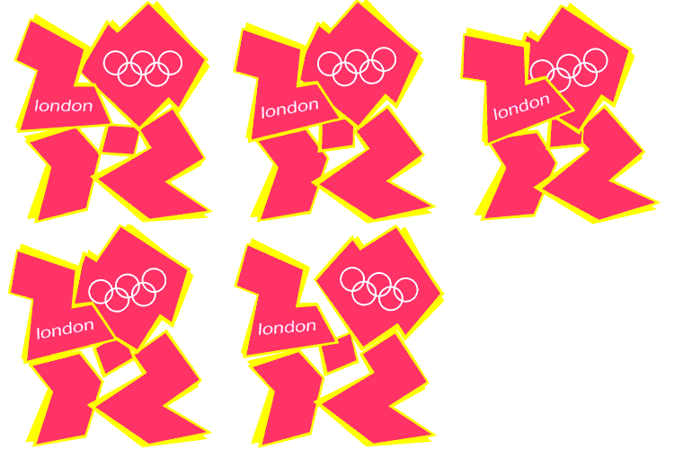
2012 logo

Sponsored Links
No it's very simple, there are loads of people producing crap, but in this country we no longer manufacture anything.
Hence the politicians all bought in to the Reggie Perrin idea, sell enough crap and sooner or later some mug will buy it.
Unfortunately it was mostly the civil service that where selling it to the government .
 
Sponsored Links
hes an idiot, talk about seeing stuff that just isnt there............
 
I only saw the mascots briefly on the rubbish Jonathan Ross show, they look like melted down Tellytubbies, and one looked like he had a huge phallus..

I recall a cartoon in the '80's when there was a bunch of cast of teddies/dolls, reminded me of that programme.

We are going do s*** at this, and we'll probably have the national pastime, rioting when the weather is nice, so lose the World cup bid too, if not already.

Strangely, before the match, England vs Mexico, I saw lots of Mexican flags hanging from houses..but I don't live in an area of high immigration.

As an opening ceremony, I'd love to see Bungle the Bear from Rainbow, smack Ken Livingstone, straight in the face..that would be a crowd pleaser.
 
When I first saw the 2012 logo I thought it was an absolute shambles. Somebody on a TV programme obviously thought the same because they went round a few schools and invited kids to design a few of their own. I'm fairly sure that some of them are shown in that link. I was particularly impressed with the one that shows LONDON 2012 within the five rings. The obvious question was this: Why did some dipstick pay a small fortune for utter crap? :?: :?: :?:

Some may say that it was an under-the-counter deal involving a large bribe - and they might be right. :evil: :evil: :evil: On the other hand, cock-up is more common than conspiracy. Maybe that 'dipstick' was a bored civil servant who couldn't give a tuppenny dicky bird about the Olympics and just picked a design company out of the yellow pages! :rolleyes: :rolleyes: :rolleyes:

I recall a similar cock-up from many years ago. British Telecom paid some design firm a lot of money to find the best colour for their new vans. The design brief was that they had to be very visible on the road. What came back was a pale grey colour with very little extra detail on it. Now if you've ever seen one of those vans under sodium street lights, you'll know that visibility isn't its strong point. Did somebody get it wrong and design a van for minimum visibilty? :LOL: :LOL: :LOL:

Here's another one from the archives. A TV programme commissioned a marketing firm to come up with alternatives to the Union Jack and the old "Made in Britain" logo, the theory being that we needed to sell ourselves better. In no time at all, the marketing gurus completely failed to understand why people preferred German cars. It had to be the way they were presented. The idea that German cars might have a well deserved reputation for reliability was completely lost on them. :rolleyes: :rolleyes: :rolleyes:

To cut a long story short, they spent a lot of time designing a little two-coloured sticker with "Britain" on it. It was absolutely pathetic. On reflection, the TV people possibly had a hidden agenda, namely to show us all what utter crap you get for your money! :LOL: :LOL: :LOL:
 
Cheap compared to an audience with Yorkie...
:D
 
london.gif
 
Nottingham city council paid £120K for a slightly wonky 'N' to replace Robin Hood.

Why is this taxpayer money allowed to be wasted? Shouldn't there be a review body vetting the expenses?
 
Nottingham city council paid £120K for a slightly wonky 'N' to replace Robin Hood.

Why is this taxpayer money allowed to be wasted? Shouldn't there be a review body vetting the expenses?

I think due to the pot being empty there will be less of this in future.............
 
And the citizens of Doncaster thought £35k was bad for
doncasterspirit_270.gif

That Emblem now adorns the major routes into Doncaster. Oh and most of the minor ones too. Dont get me wrong, its better than a plain "Doncaster", but £35k? They could have let some art students at the town's art college design it for free!!! :evil:
 
The best waste of money (or worst), recently, have got to be the BBC logo changing from Black Blocks with the BBC logo in white, slightly tilted; to the current, exactly the same, but straight.

And the Natwest Bank tri logo, with three white bands, changing to a subtle same as, but the end of the three bands ends in a slight red tint..

Now, I used to repair ATM for NWB, and it was common place for the advert panel to slip (the signage above the ATM), and display this exact logo, long before NWB adopted it as their new logo..HSBC (Midland) also had the same problem, when they were still Midland bank.
 
Sponsored Links
Back
Top