Drawing a graph in Excel

Joined
24 Jul 2003
Messages
24,294
Reaction score
1,419
Location
London
Country
United Kingdom
I have
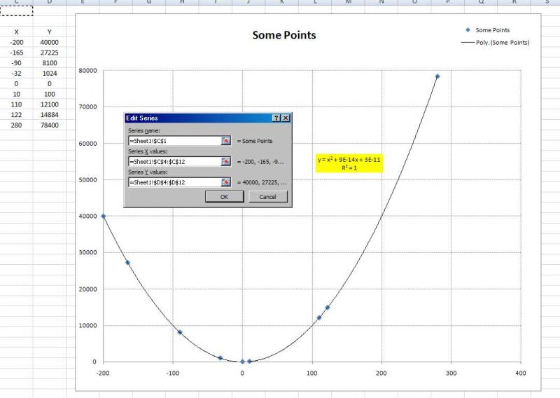
a column of temperatures in A
A column of resistances in B
I want a graph of A against B.
If I highlight the two columns and click the pic in the chart toolbar, I get a graph of resistances against the number of the row it's on.

How can I make the data source for the X axis be the figures in column A?

I get this:
60774658to7.jpg
 
Sponsored Links
See next post...

from Office 2007.

:?:
 
Thanks but that's the graph I get, and it's not what I need.

My temperatures aren't 1,2,3,4,5 etc, they're
-46, -43, -40 etc, and not all in 3 degree steps.
 
Right click the graph, choose Source Data, then go to the series tab.

Highlight the Temperature Series from the list to the left, the click remove. Now go to the Category (X) Axis Labels box at the bottom, and click the icon to the right of the text box. Select the temperature data and close the range window that has opened. If you now accept this your graph should have one data range plotted, using the temperature data as the x axis.
 
Sponsored Links

Yep, sorry thought everyone did that way - selecting data...

Adjusted start / end values, crossing points for both axes.

Used scatter points - no line - fitted trendline - normally look for value of R to be nearest to val of 1... In this case poly' order 2....

:cool:
 
Back
Top